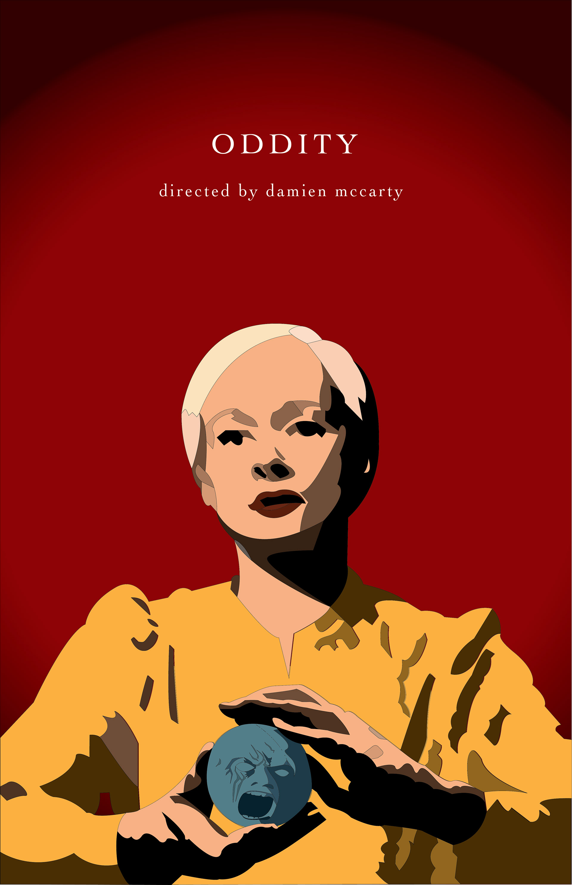
For this project, I was tasked with creating a movie poster with a cohesive color palette, detailed design and key visual elements from the film. I chose the horror/thriller film "Oddity" (2024) and chose a triadic color scheme (red, yellow, and blue) to stay authentic to the character colors as well as display the sinister energy of the main character. By using a deep blood red, the design shows danger and revenge, but the yellow shows the juxtaposition the comforting, inviting energy of the main character, Darcy. The blue, displaying a cold, wooden figure from the movie, gives the feeling of something frozen in time, as the figure does not move throughout the movie. By including a dark to bright red gradient, the figurative walls of the poster seem to be closing in on the viewer, creating a sense of claustrophobia and danger.
As for my process for this project, I first researched different movie poster designs. Specifically referencing horror movies like "Get Out" I found that they were very simple, often tying in minimal color schemes and color blocking to leave the horror to the imagination. I began by looking at the official movie-branded "Oddity" posters to draw inspiration but to confirm that I was beginning with an original idea. I then brainstormed symbols from the movie, including the doorbell, door shutter, and wooden man. Through classroom deliberation, I decided that the best way to show Darcy's control of the "oddities" in the movie was to show her holding or manipulating one of them. My final design shows Darcy in a position of power, dominating the wooden man's head, as well as the majority of the space in the poster, encouraging the viewer to watch and learn more about her story.
Pinterest Board Inspiration: https://pin.it/4aM5A6QMn