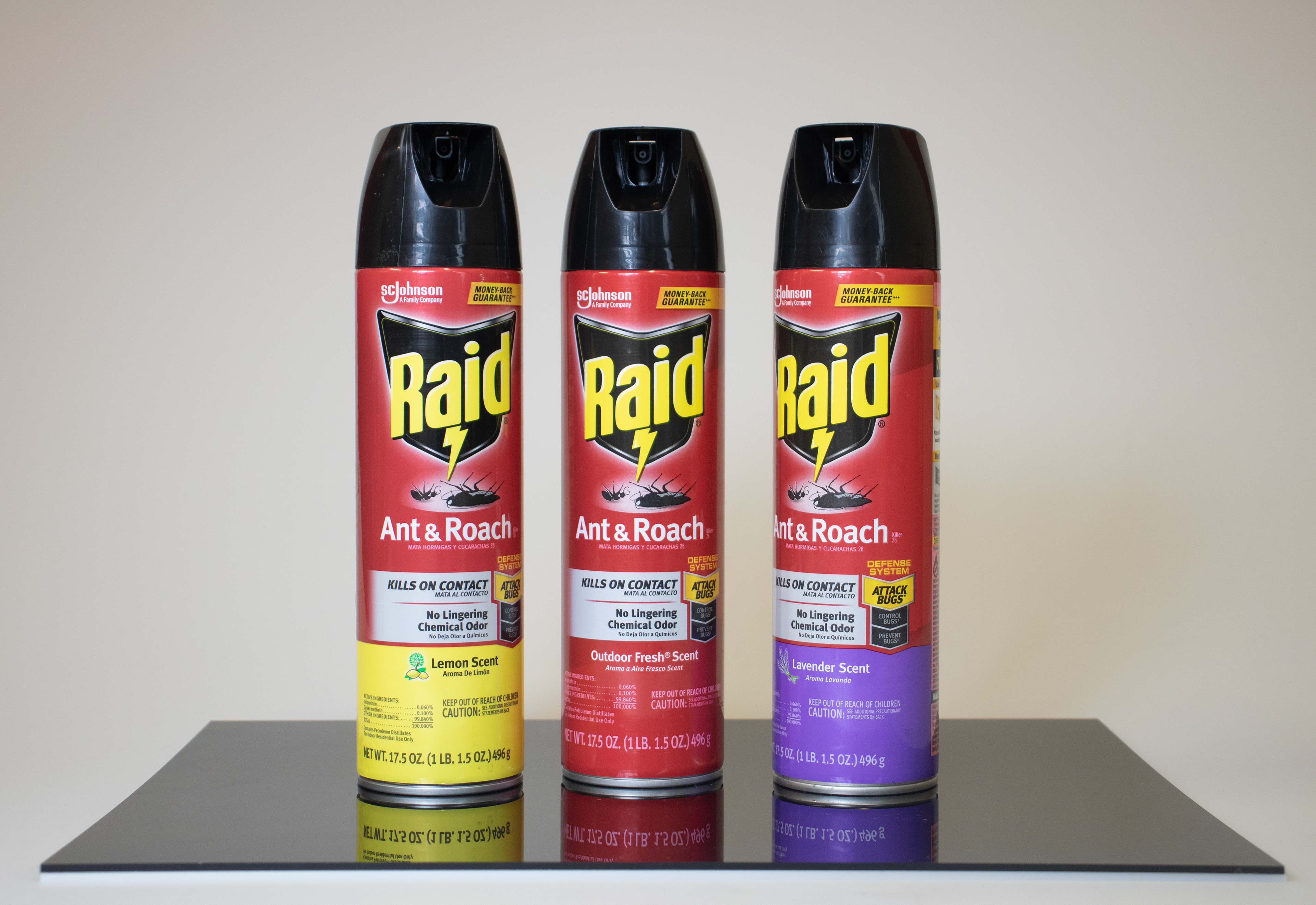
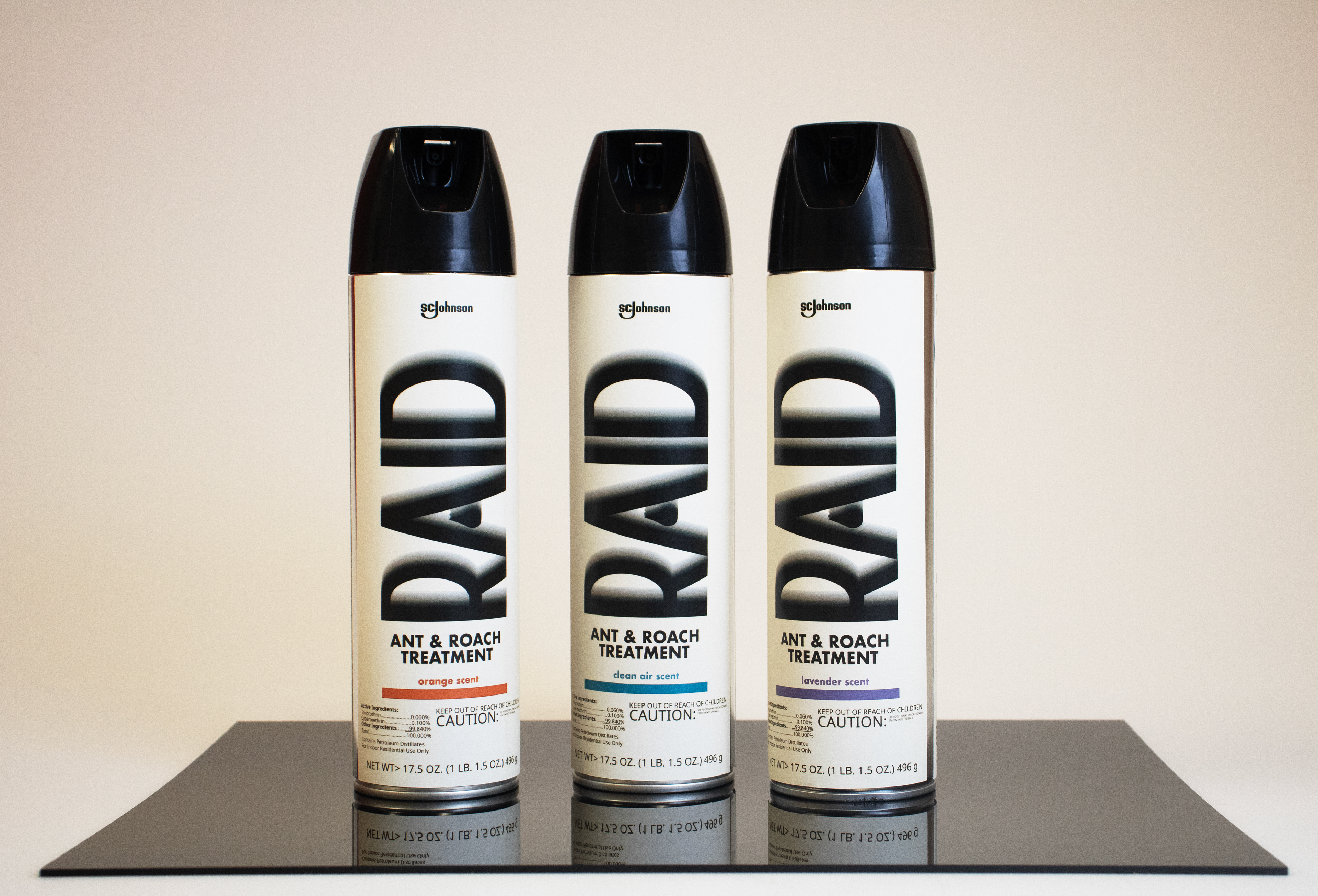
The goal of this project was to redesign RAID Ant & Roach to an aesthetically appealing, luxury product. I was inspired by the idea of "peaceful euthanasia" as opposed to aggressive extermination, with focus on a clean, simple, minimal look.
BEFORE AND AFTER
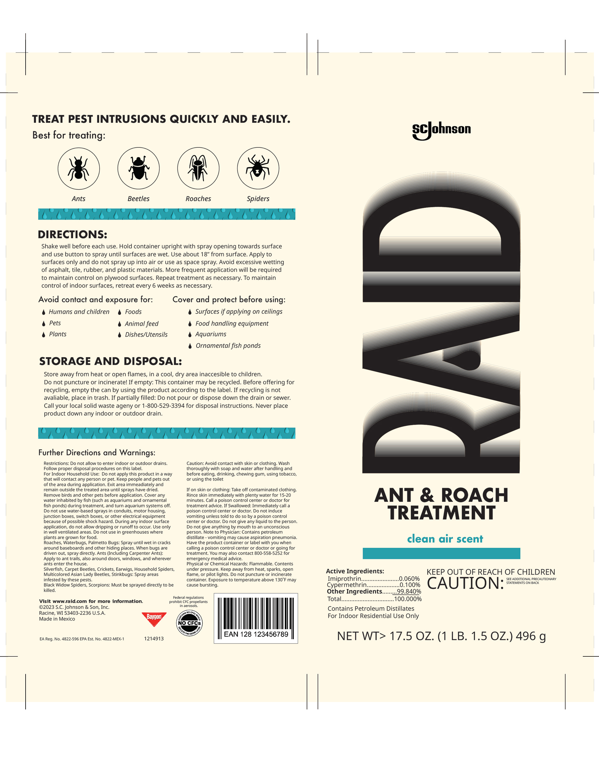
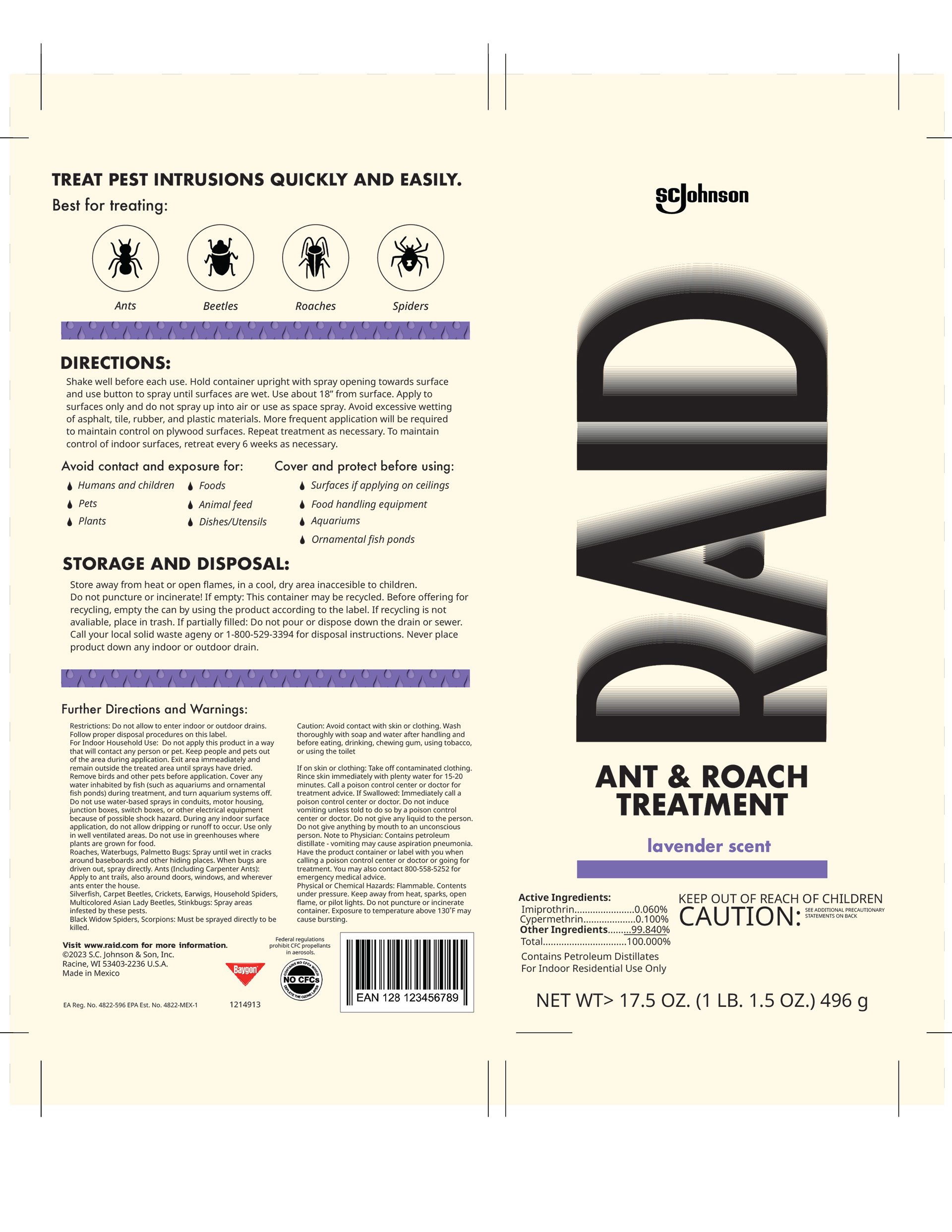
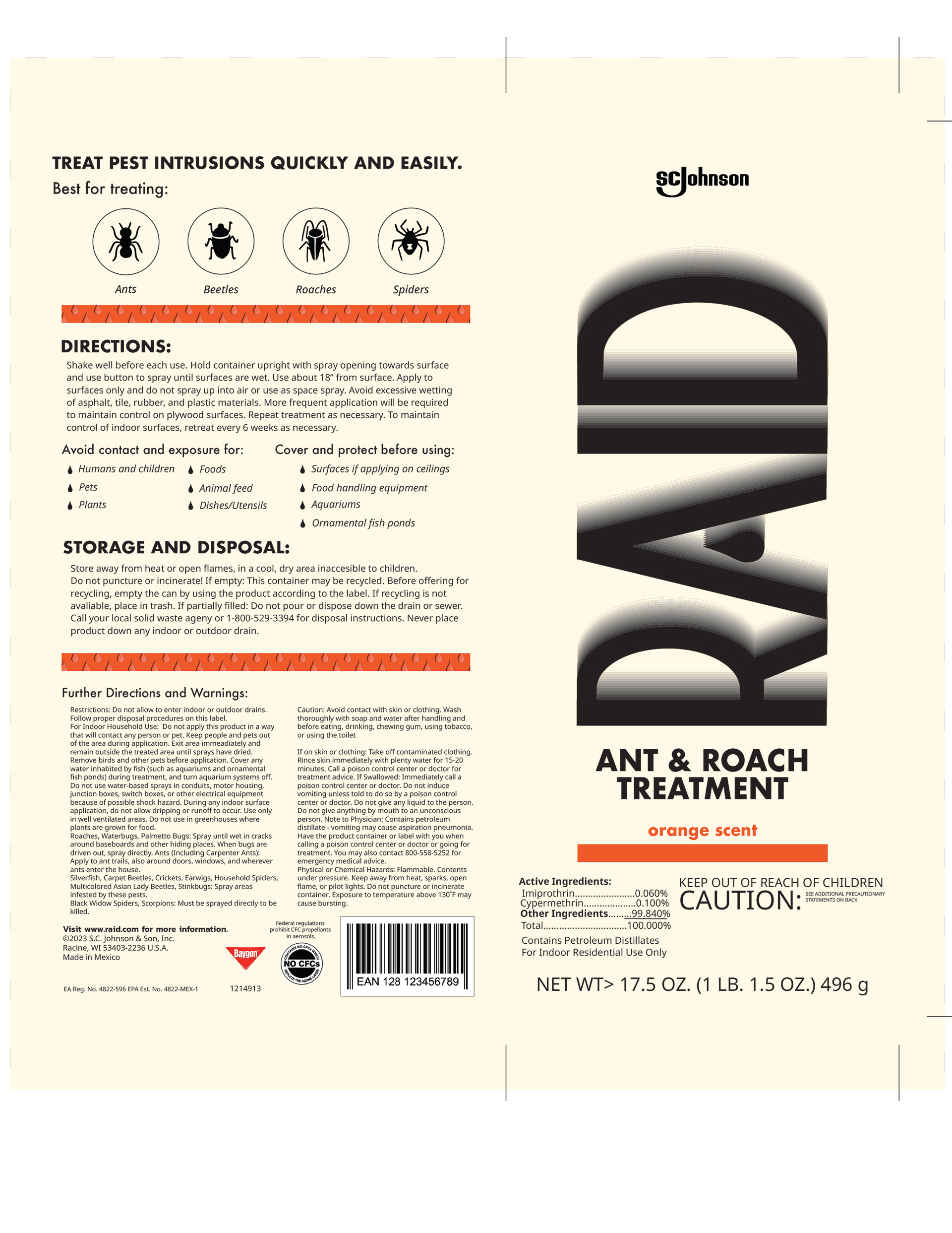
With the design of the back, I was challenged to include all necessary warnings and information, while also remaining legible and simple.
FINALIZED PRINTABLES
FINAL LOGO REDESIGN
The final logo redesign employed the drop shape as a flexible design piece, to be applied to different packaging and branding elements.
HAND-DRAWN ICON ILLUSTRATIONS