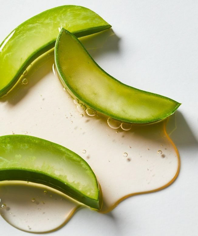
To begin my process, I found this inspirational image. From this image, I created a list of words to signify the vibe and direction of my redesign.
Natural
Green
Clean
Organic
Smooth
Bubbly
Clear
Cleansing
Moisture
Calming
Water
Flowing
Kind
Gentle
Relaxing
Soft
Benevolent
Wet
Simple
Soothing
Plant
Pure
Fresh
Serene
Tranquil
Dewy
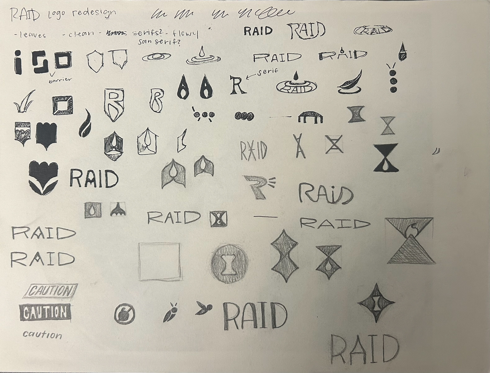
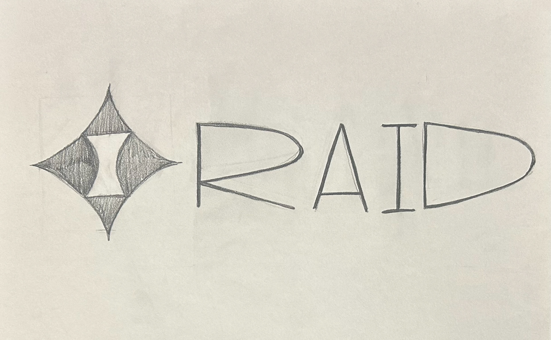
LOGO IDEATION:
I created logo ideas based on ideas of "defense", as well as shapes tied to nature and water. I also experimented with typography, thinking about how thin letters emulate luxury and simplicity.
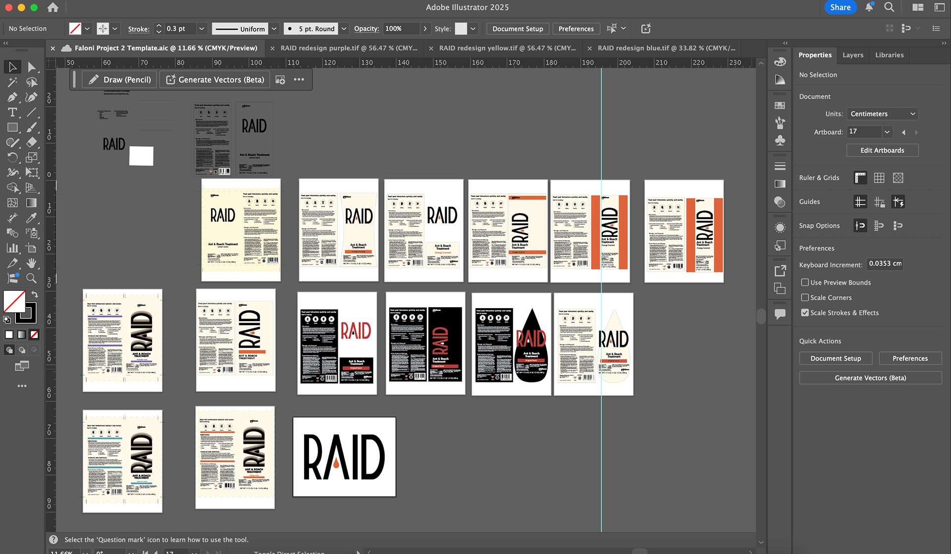
ROUGH DRAFT LOGO LOCKUPS
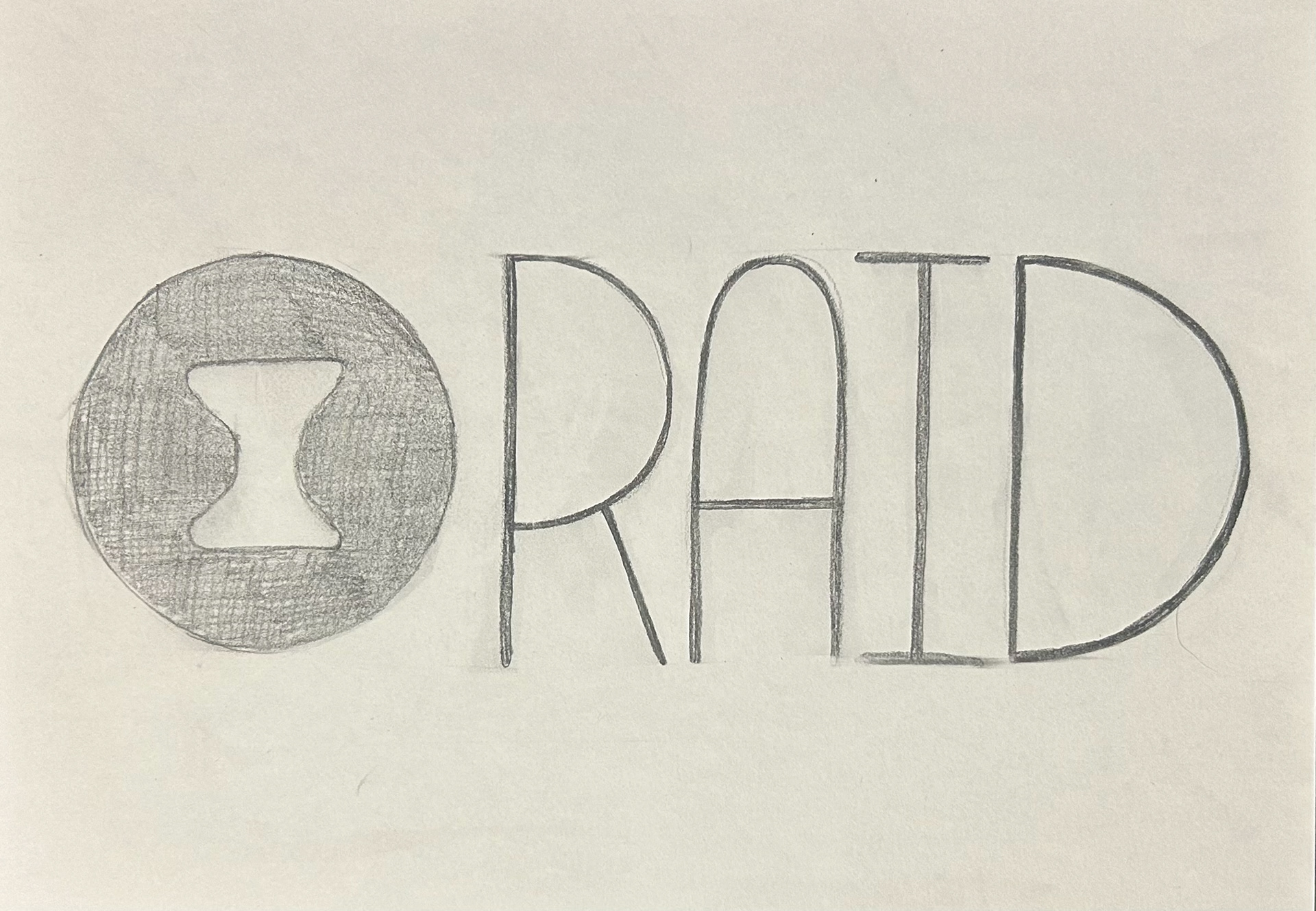
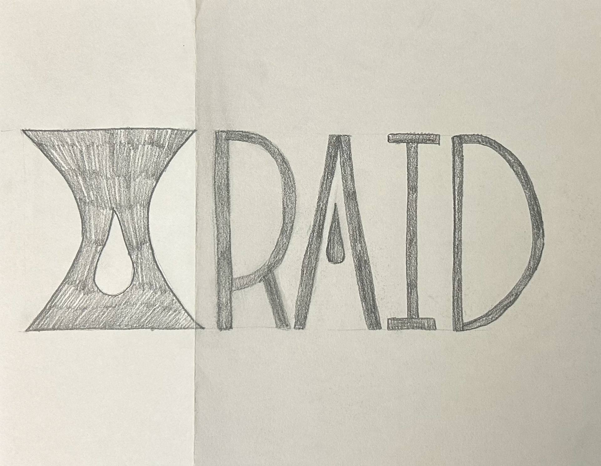
After receiving feedback from my peers, I created these three logo lockups as rough drafts of my logo. Critique lead me to my final logo design, which was the logotype of the third draft.
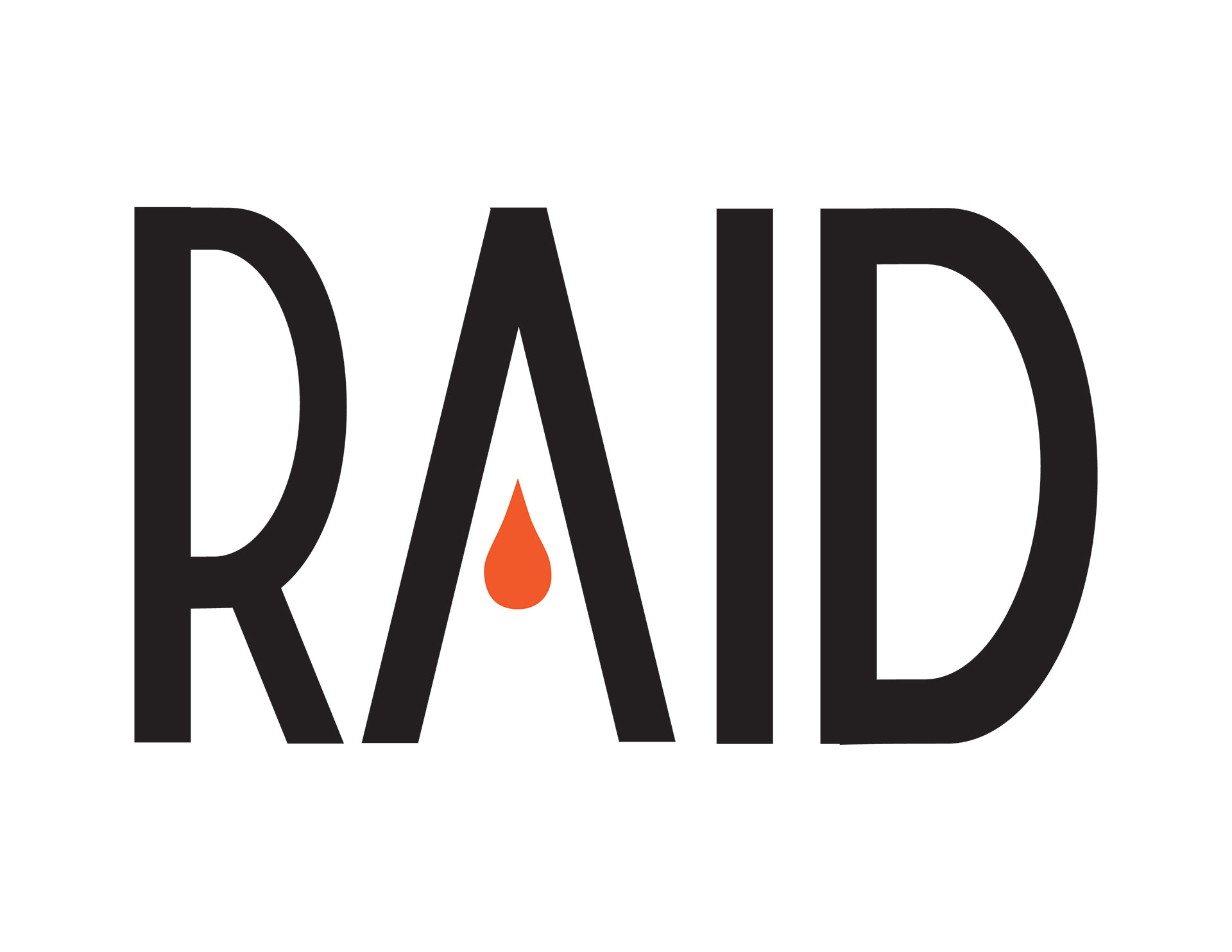
The logotype was chosen because of the cylindrical nature of the can, as the type would be most legible, and the "drop" shape in the A could be applied as a flexible logo piece in different branding appplications.
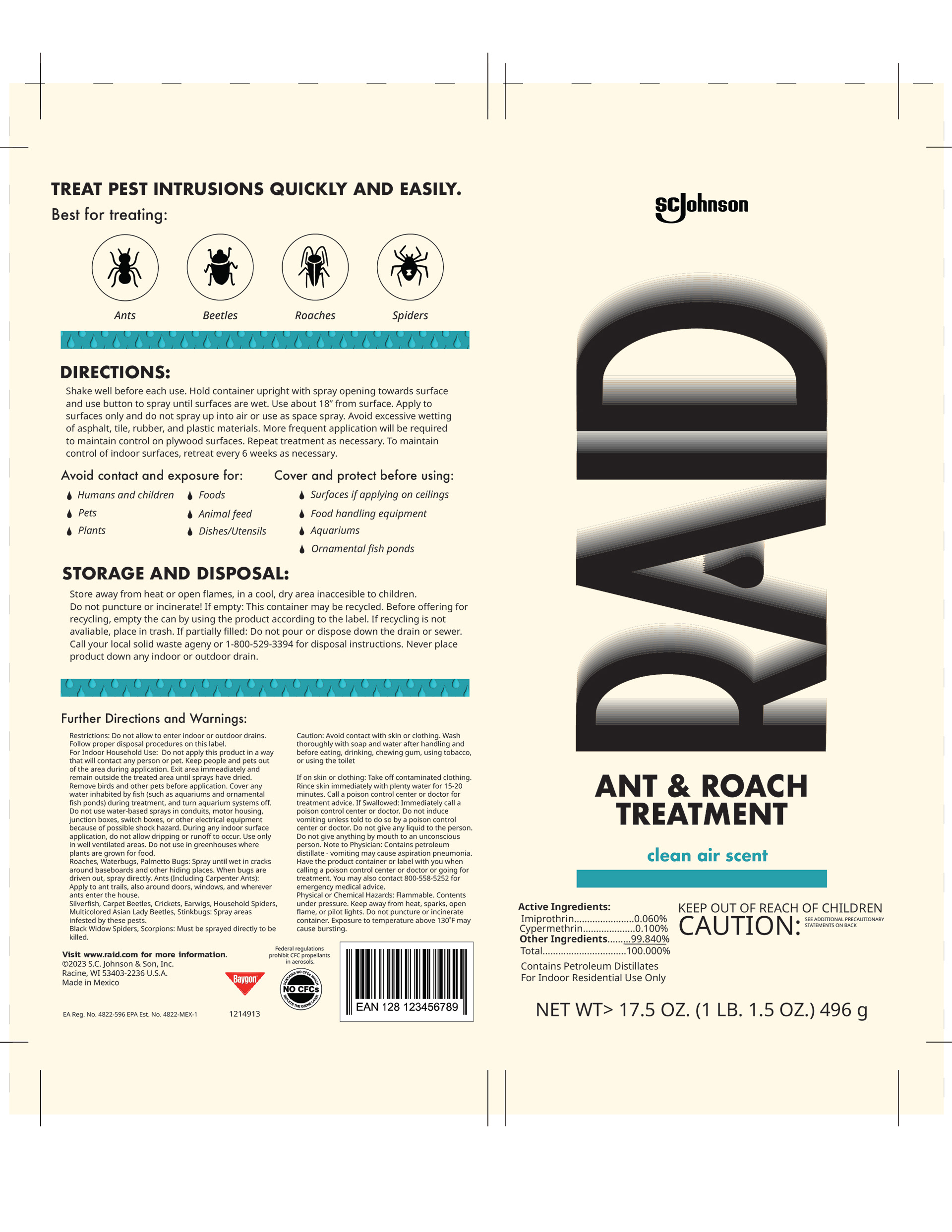
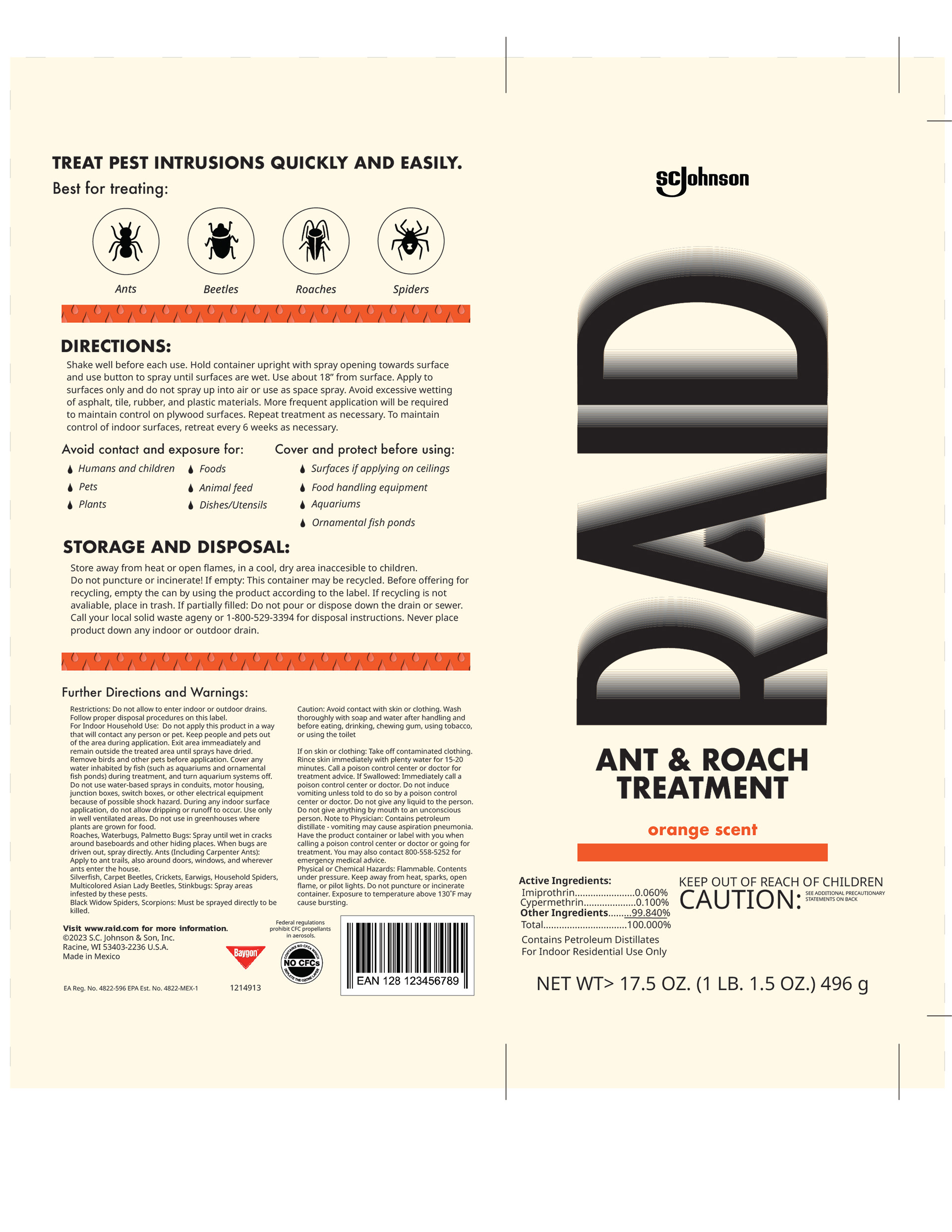
From there, I began mocking up the entire packaging label. I prioritized readability, clean lines, and simplicity, significantly lowering the amount of text on the back of the packaging.
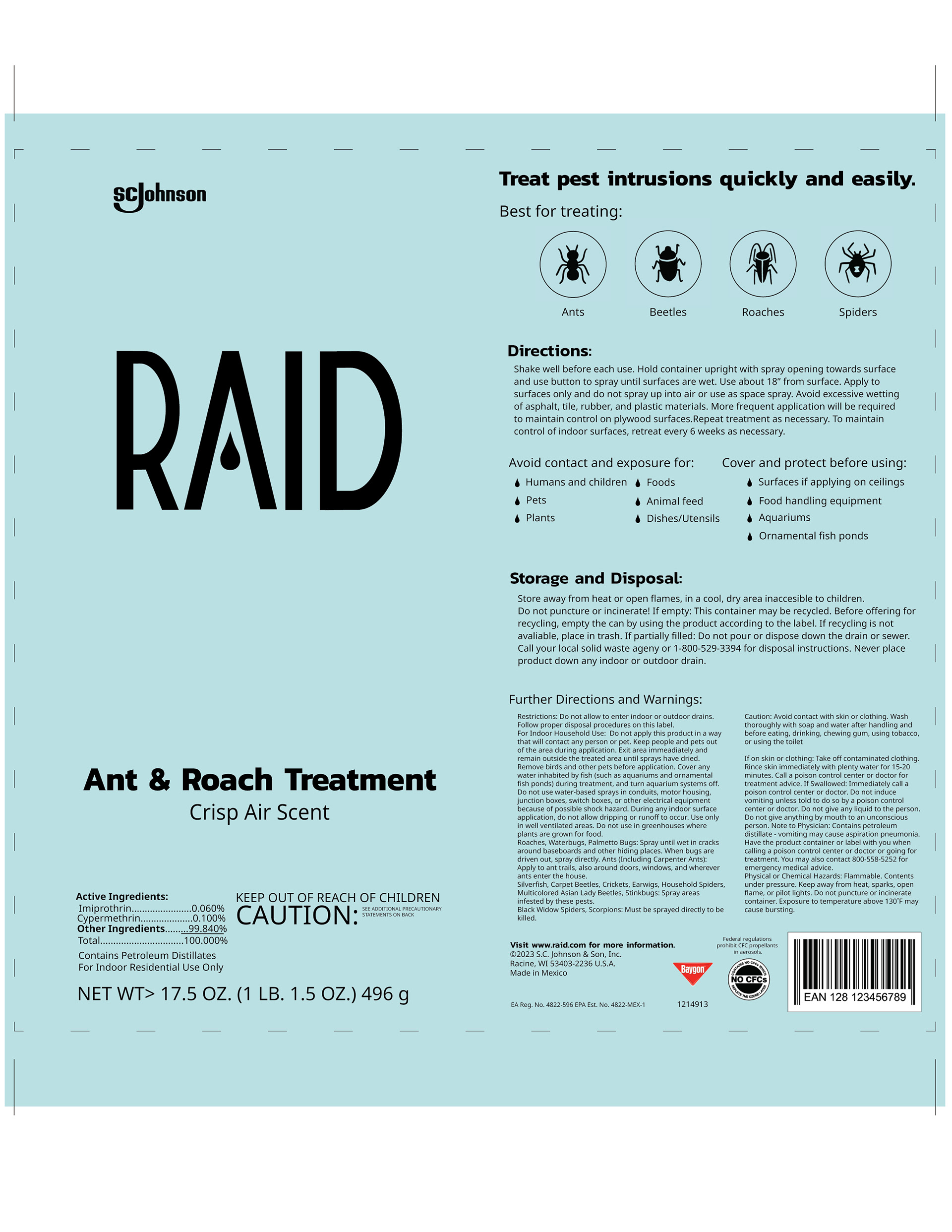
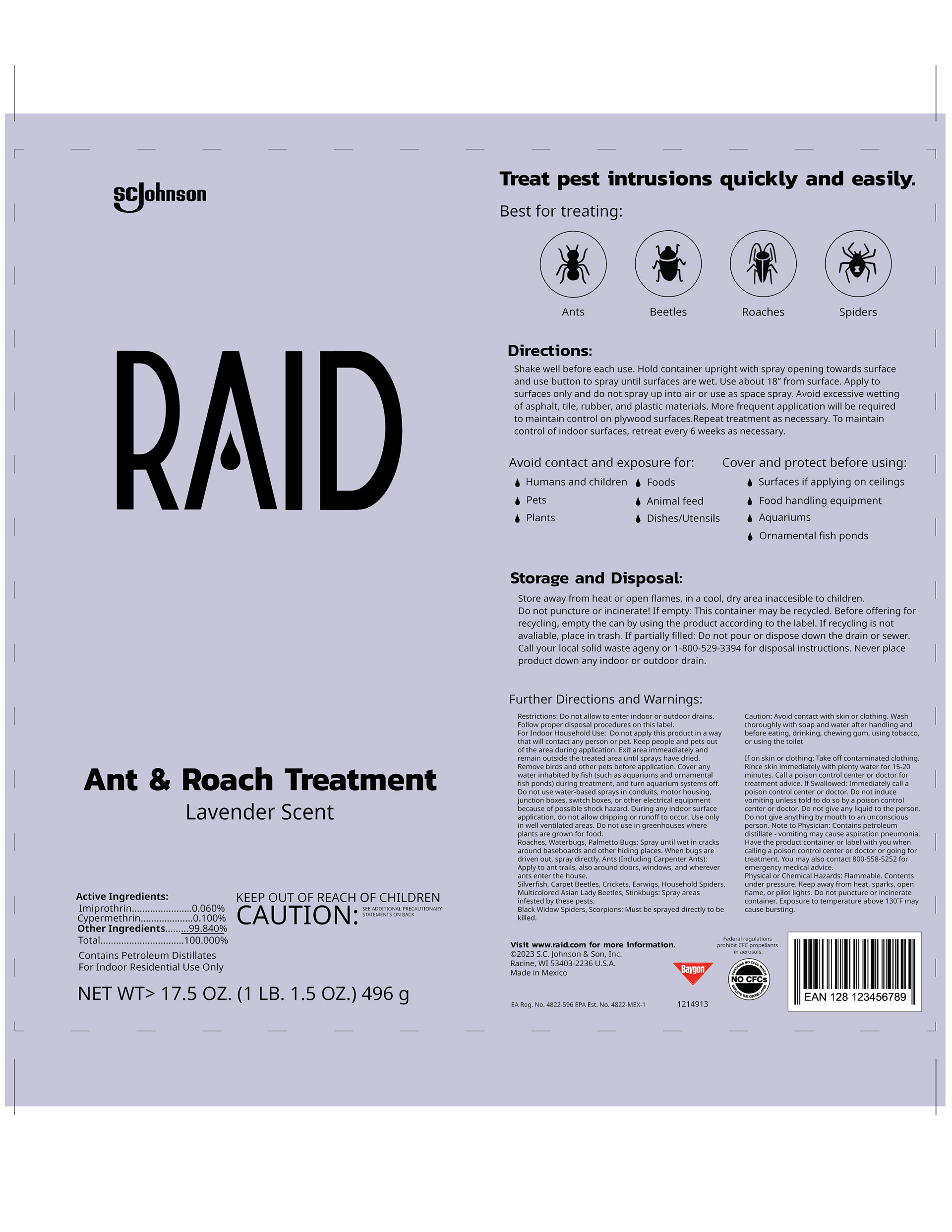
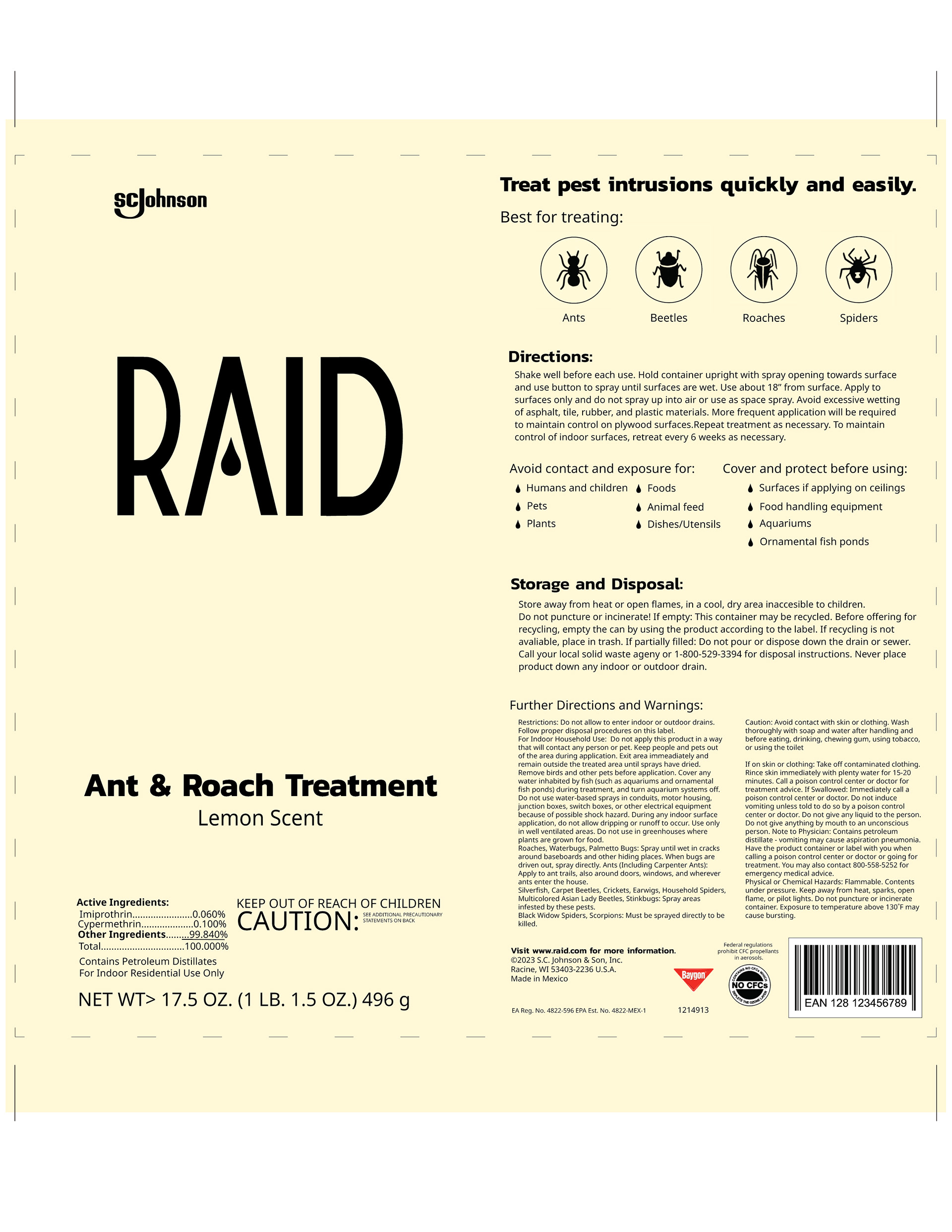
From there, I experimented with direction, size, typography, effects, and color until I reached my final design.
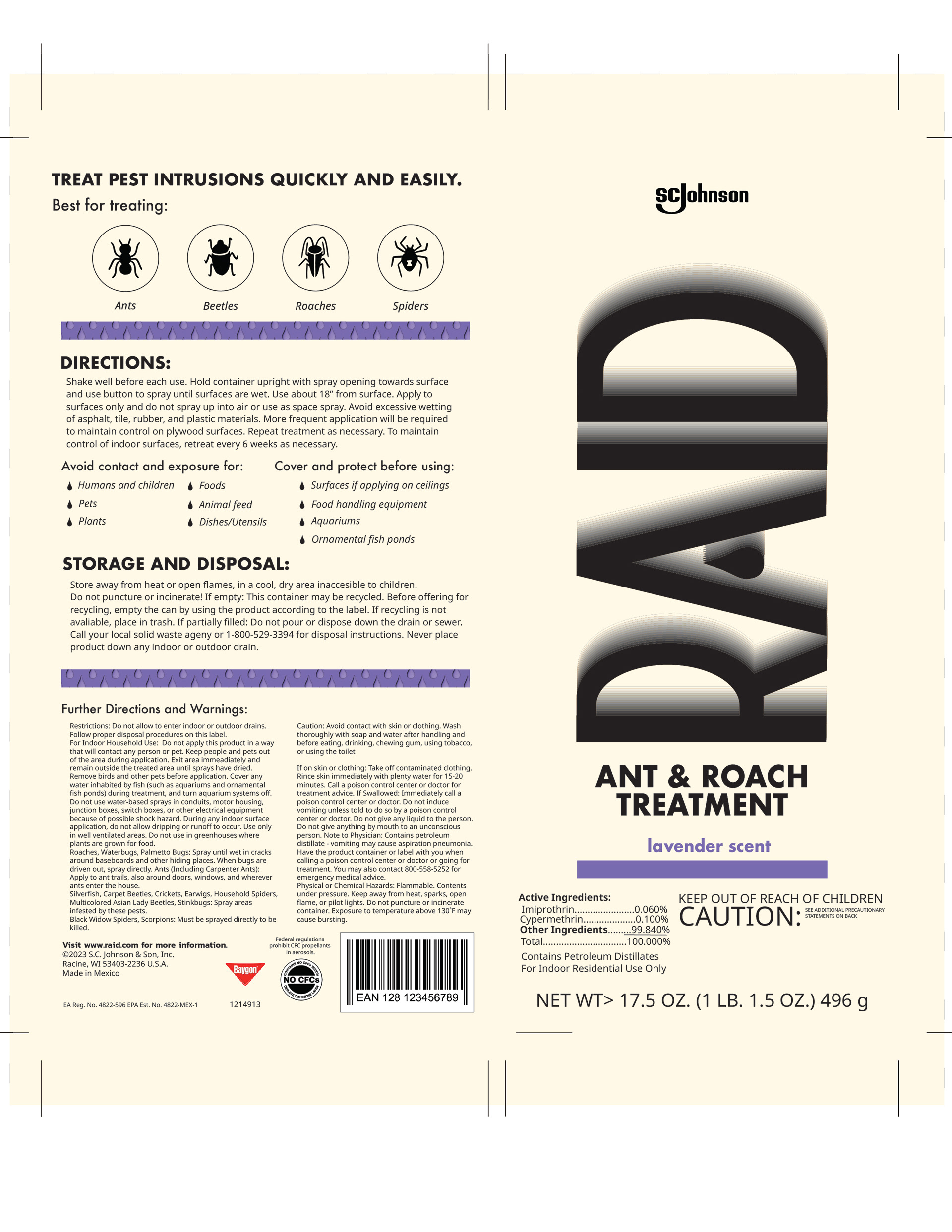
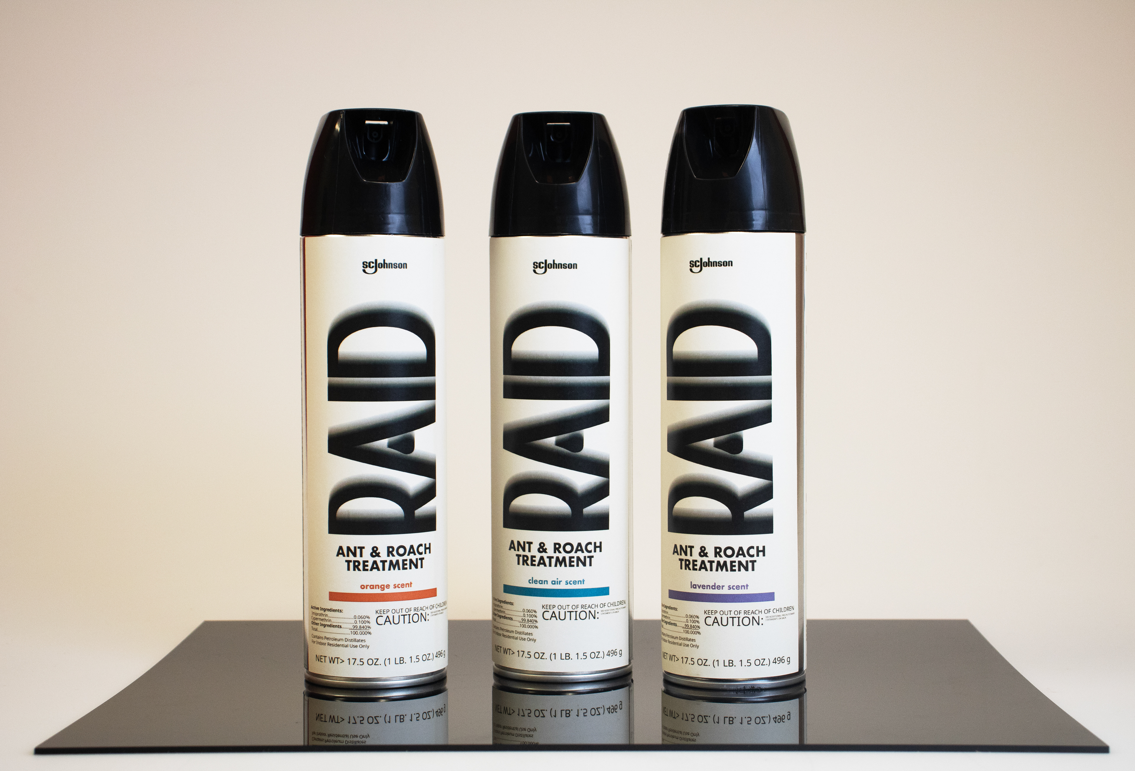
FINALIZED DESIGNS
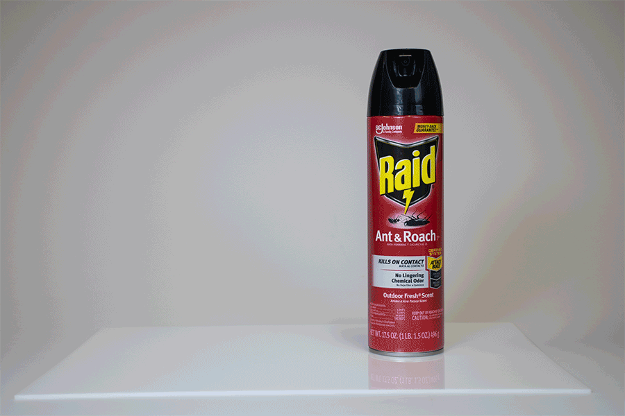
These designs were then applied with matte sticker paper to the original RAID cans, and photographed to display on my portfolio.
I also created a GIF of my new RAID can "chasing" the old can out of frame, which I created through stop motion photography, illustration, and editing in Adobe Photoshop.